Description.
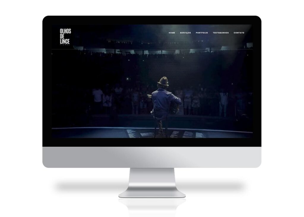
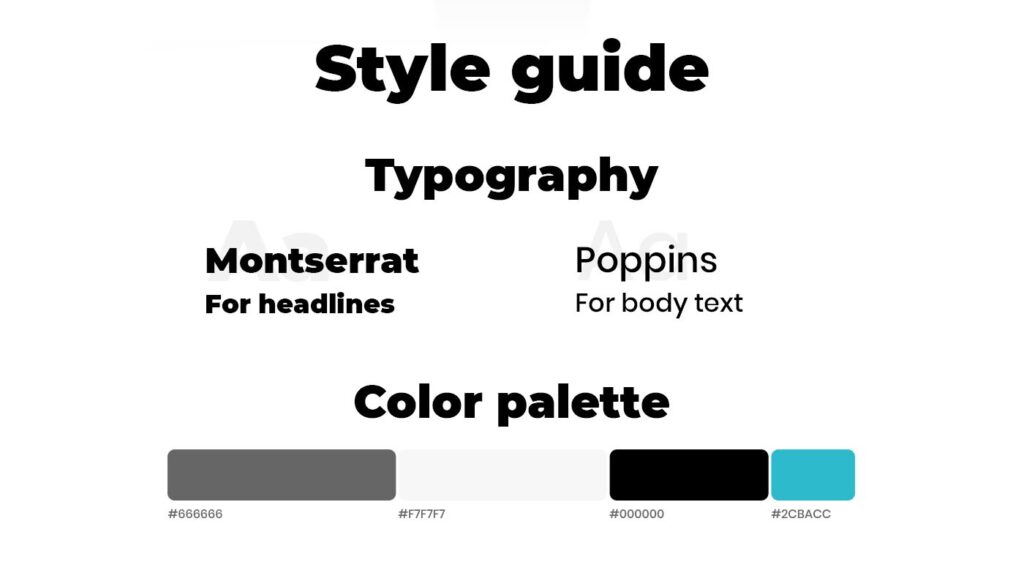
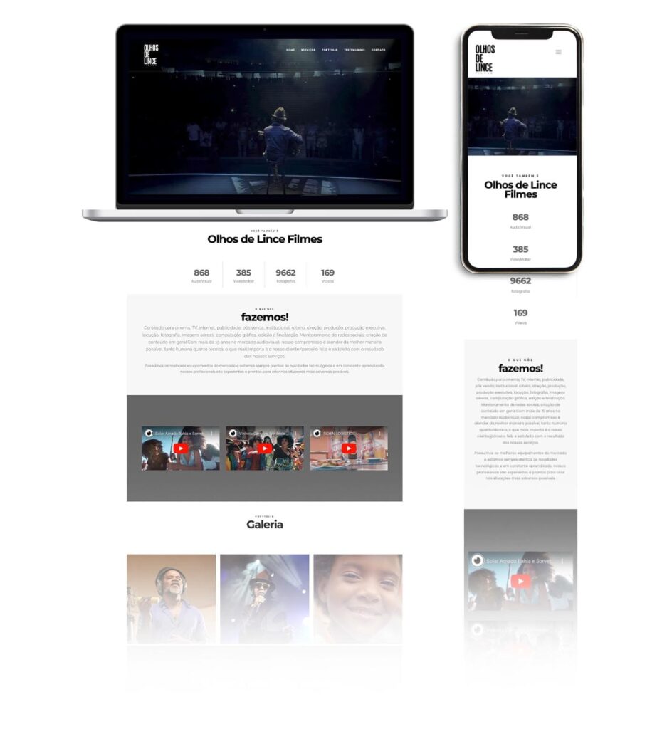
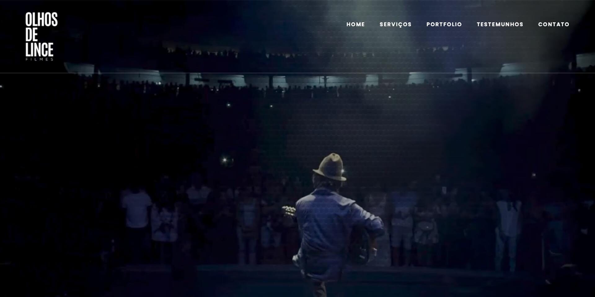
A layout created for “Olhos de Lince” (“Lince’s Eyes” in English), an audiovisual leading production company based in Brazil, with several popular artists as clients. The website was carefully designed to have a clean and lightweight layout, with a primary focus on showcasing the company’s impressive video portfolio. The predominant color scheme combines neutral colors to make the user feel inside the videos, with nothing else to disturb their attention. Elegant and modern fonts were used to keep the minimalist and dynamic style design on each detail. It was chosen Montserrat for the headings and Poppins for the body text.
